
Chet.Admin 模块详解⑦:不依赖图表库的 SVG 趋势图 📊
《Chet.Admin 全栈实战》系列第 13 篇
前言
后台系统的仪表盘,往往是产品的"门面"。
但门面通常有个矛盾:
- 想好看 → 引入 ECharts、AntV、Chart.js,包体积瞬间 +500KB
- 想轻量 → 自己画,但效果差、交互弱
Chet.Admin 走了第三条路:纯 SVG 手绘折线图。
- ✅ 渐变曲线
- ✅ 面积填充
- ✅ 自动刻度计算
- ✅ 数据点 hover tooltip
- ✅ 垂直辅助线
- ✅ 暗色模式自适应
0 第三方图表库依赖。今天这篇就来拆开看实现。
一、后端:3 个接口
1.1 控制器
DashboardController.cs 只暴露 3 个接口:
[HttpGet("stats")]        // 统计指标
[HttpGet("trend")]        // 趋势数据
[HttpGet("recent-logs")]  // 最近操作
精简到位,没有冗余的"获取用户列表"之类接口(仪表盘不该承担业务 CRUD)。
1.2 GetStatsAsync:6 项核心指标
DashboardService.GetStatsAsync 返回 6 个统计数字:
public async Task<DashboardStatsDto> GetStatsAsync()
{
    var today = DateTime.UtcNow.Date;

    var userCount = await _dbContext.Users.CountAsync();
    var roleCount = await _dbContext.Roles.CountAsync();
    var menuCount = await _dbContext.Menus.CountAsync();
    var deptCount = await _dbContext.Departments.CountAsync();

    var todayLoginCount = await _dbContext.AuditLogs
        .Where(x => x.Action == "Login" && x.OperatedAt >= today)
        .CountAsync();

    var sevenDaysAgo = DateTime.UtcNow.AddDays(-7);
    var activeUserCount = await _dbContext.AuditLogs
        .Where(x => x.OperatedAt >= sevenDaysAgo)
        .Select(x => x.UserId)
        .Distinct()
        .CountAsync();

    return new DashboardStatsDto
    {
        UserCount = userCount,
        RoleCount = roleCount,
        MenuCount = menuCount,
        DepartmentCount = deptCount,
        TodayLoginCount = todayLoginCount,
        ActiveUserCount = activeUserCount,
    };
}
6 项指标分两类:
| 类型 | 指标 | 数据源 |
|---|---|---|
| 静态总量 | 用户/角色/菜单/部门数量 | 各表 Count() |
| 动态行为 | 今日登录数 / 7 日活跃用户数 | AuditLogs 表 |
亮点:
- 活跃度复用审计日志:不需要单独建"登录日志"表,
AuditLogs里Action == "Login"的记录就是登录日志 Distinct().CountAsync()算 7 日活跃:去重后统计用户数,SQL 层完成,不拉到内存DateTime.UtcNow.Date拿当天 0 点,作为"今日"的起点
1.3 GetTrendAsync:登录趋势
public async Task<DashboardTrendDto> GetTrendAsync(int days = 7)
{
    var items = new List<TrendItem>();
    for (int i = days - 1; i >= 0; i--)
    {
        var date = DateTime.UtcNow.Date.AddDays(-i);
        var nextDate = date.AddDays(1);

        var loginCount = await _dbContext.AuditLogs
            .Where(x => x.Action == "Login"
                     && x.OperatedAt >= date
                     && x.OperatedAt < nextDate)
            .CountAsync();

        items.Add(new TrendItem
        {
            Date = date.ToString("MM-dd"),
            RegisterCount = 0,
            LoginCount = loginCount,
        });
    }

    return new DashboardTrendDto { Items = items };
}逐天循环查询,每天统计 [date, nextDate) 区间内的登录次数。
潜在优化点(生产环境):
如果 days 较大(比如 365 天),会产生 N 次 SQL 查询。生产建议改成一次 GROUP BY:
var sevenDaysAgo = DateTime.UtcNow.Date.AddDays(-6);
var rawData = await _dbContext.AuditLogs
    .Where(x => x.Action == "Login" && x.OperatedAt >= sevenDaysAgo)
    .GroupBy(x => x.OperatedAt.Date)
    .Select(g => new { Date = g.Key, Count = g.Count() })
    .ToListAsync();
但 Chet.Admin 默认 7 天,循环 7 次完全可接受,代码更直白。
1.4 GetRecentLogsAsync:最近操作
public async Task<List<RecentLogItem>> GetRecentLogsAsync(int count = 10)
{
    return await _dbContext.AuditLogs
        .AsNoTracking()
        .OrderByDescending(x => x.OperatedAt)
        .Take(count)
        .Select(x => new RecentLogItem
        {
            Id = x.Id,
            UserName = x.UserName,
            Action = x.Action,
            Module = x.Module,
            Description = x.Description,
            OperatedAt = x.OperatedAt,
        })
        .ToListAsync();
}
简单直接:按时间倒序取 Top N。AsNoTracking() 优化:审计日志只读,EF Core 不需要追踪变更。
1.5 DTO 设计
DashboardStatsDto.cs 包含 4 个 DTO:
public class DashboardStatsDto
{
    public int UserCount { get; set; }
    public int RoleCount { get; set; }
    public int MenuCount { get; set; }
    public int DepartmentCount { get; set; }
    public int TodayLoginCount { get; set; }
    public int ActiveUserCount { get; set; }
}

public class DashboardTrendDto
{
    public List<TrendItem> Items { get; set; } = new();
}

public class TrendItem
{
    public string Date { get; set; } = string.Empty;
    public int RegisterCount { get; set; }
    public int LoginCount { get; set; }
}

public class RecentLogItem
{
    public int Id { get; set; }
    public string UserName { get; set; } = string.Empty;
    public string Action { get; set; } = string.Empty;
    public string Module { get; set; } = string.Empty;
    public string Description { get; set; } = string.Empty;
    public DateTime OperatedAt { get; set; }
}
注意 TrendItem 有 RegisterCount 和 LoginCount 两个字段,目前 RegisterCount 始终返回 0,预留了扩展位,未来加注册曲线时直接用。
二、前端:并发加载 + 优雅降级
views/dashboard/index.vue 的 onMounted 用了并发加载 + 错误兜底模式:
onMounted(async () => {
  updateTime();
  timer = setInterval(updateTime, 1000);
  try {
    const [statsRes, trendRes, logsRes] = await Promise.all([
      getDashboardStatsApi().catch(() => null),
      getDashboardTrendApi(7).catch(() => null),
      getRecentLogsApi(10).catch(() => null),
    ]);
    if (statsRes) stats.value = statsRes;
    if (trendRes?.items) trendItems.value = trendRes.items;
    if (logsRes) recentLogs.value = logsRes;
  } catch {
    /* */
  } finally {
    loading.value = false;
  }
});三个关键设计:
2.1 Promise.all 并发
3 个接口并发请求,不是串行 await。首屏时间降到最长接口的耗时,而不是三者之和。
2.2 每个 Promise 单独 catch
getDashboardStatsApi().catch(() => null)如果某个接口失败,不会拖累其他接口:
- 统计接口挂了 → 统计卡片显示 0
- 趋势接口挂了 → 趋势图显示"暂无数据"
- 日志接口挂了 → 操作列表显示"暂无操作记录"
局部失败不影响整体渲染,这是仪表盘该有的健壮性。
2.3 if 兜底赋值
if (statsRes) stats.value = statsRes;
if (trendRes?.items) trendItems.value = trendRes.items;
if (logsRes) recentLogs.value = logsRes;
只赋值成功的部分。失败的保持默认值(空数组/0)。
对比反面教材:
// ❌ 一挂全挂
const [stats, trend, logs] = await Promise.all([
  getDashboardStatsApi(),
  getDashboardTrendApi(),
  getRecentLogsApi(),
]);
任何一个失败都会让整个 Promise.all reject,前端拿不到任何数据。
三、统计卡片:6 项指标视觉化
3.1 卡片栅格
<div class="stats-grid">
  <div class="stat-card" style="--accent: #6366f1">
    <div class="stat-icon"><IconifyIcon icon="lucide:users" width="24" /></div>
    <div class="stat-info">
      <div class="stat-value">{{ stats.userCount }}</div>
      <div class="stat-label">用户总数</div>
    </div>
  </div>
  <!-- ... 5 个类似卡片 ... -->
</div>.stats-grid {
display: grid;
grid-template-columns: repeat(6, 1fr); /* 6 列 */
gap: 20px;
padding: 0 40px;
margin-top: -24px; /* 负 margin 让卡片上浮 */
position: relative;
z-index: 2;
}视觉技巧:
margin-top: -24px让卡片压在英雄区上,形成层次感- 每张卡片用
--accentCSS 变量驱动图标颜色和背景色 - hover 时
translateY(-4px)上浮,阴影加深
3.2 CSS 变量驱动配色
.stat-icon {
  width: 48px;
  height: 48px;
  border-radius: 12px;
  background: color-mix(in srgb, var(--accent) 10%, transparent);
  color: var(--accent);
}
color-mix 是现代 CSS 函数:
- 把
--accent颜色和透明色按比例混合 - 得到 10% 透明度的同色背景
好处:
- 改
--accent一处,图标颜色 + 背景色全部联动 - 不需要写 6 套样式
6 张卡片各有主题色:
| 卡片 | 颜色 | 含义 |
|---|---|---|
| 👤 用户总数 | #6366f1 靛蓝 | 中性、稳重 |
| 🛡️ 角色数量 | #f59e0b 琥珀 | 警示感 |
| 📋 菜单项数 | #10b981 翠绿 | 增长 |
| 🏢 部门数量 | #3b82f6 蓝 | 平静 |
| 🔐 今日登录 | #ef4444 红 | 重要 |
| 📈 7 日活跃 | #8b5cf6 紫 | 高级 |
四、SVG 折线图:核心实现
这是整篇文章的重点。我们逐段拆解。
4.1 图表坐标系
const chartWidth = 640;
const chartHeight = 220;
const chartPaddingX = 48;       // 左侧留纵坐标标签空间
const chartPaddingY = 24;       // 顶部留白
const chartBottomPadding = 32;  // 底部留 X 轴标签空间

const plotW = computed(() => chartWidth - chartPaddingX - 16);     // 绘图区宽度
const plotH = computed(() => chartHeight - chartPaddingY - chartBottomPadding); // 绘图区高度坐标系约定:
- 原点在 SVG 左上角(标准 SVG 坐标系)
chartPaddingX= Y 轴到左边的距离chartPaddingY= 顶部到绘图区上沿的距离- Y 轴向下为正,但数据值越大 y 越小(要反向计算)
4.2 自动刻度计算
最有意思的一段:
const chartMaxVal = computed(() => {
  const items = trendItems.value;
  if (!items.length) return 10;
  const rawMax = Math.max(...items.map((i) => i.loginCount), 1);
  // 向上取整到 5 的倍数,避免数据点贴顶
  return Math.max(5, Math.ceil(rawMax / 5) * 5);
});
为什么向上取整到 5 的倍数?
假设 rawMax = 17:
- 直接用 17:刻度是 0, 4.25, 8.5, 12.75, 17 —— 丑陋
- 取 20:刻度是 0, 5, 10, 15, 20 —— 整齐
Math.ceil(rawMax / 5) * 5 就是这个效果。
Math.max(5, ...) 兜底:如果 rawMax = 0(没人登录),刻度也至少是 5,避免出现"全 0 刻度"。
4.3 纵坐标 4 档刻度
const yAxisTicks = computed(() => {
  const max = chartMaxVal.value;
  const ph = plotH.value;
  const steps = 4;
  return Array.from({ length: steps + 1 }, (_, i) => {
    const ratio = i / steps;  // 0, 0.25, 0.5, 0.75, 1
    const value = Math.round(max * ratio);
    const y = chartPaddingY + ph - ratio * ph;
    return { value, y };
  });
});
生成 5 个刻度点(0/25/50/75/100%):
value:刻度数值(0, max/4, max/2, 3max/4, max)y:SVG 坐标(反向:ratio 越大 y 越小,因为越往上)
反向公式:
y = chartPaddingY + ph - ratio * phratio = 0(最低)→y = chartPaddingY + ph(绘图区底部)ratio = 1(最高)→y = chartPaddingY(绘图区顶部)
4.4 数据点坐标计算
const trendPoints = computed(() => {
  const items = trendItems.value;
  if (!items.length) return '';
  const max = chartMaxVal.value;
  const pw = plotW.value;
  const ph = plotH.value;

  return items
    .map((item, idx) => {
      const x = chartPaddingX + (idx / Math.max(items.length - 1, 1)) * pw;
      const y = chartPaddingY + ph - (item.loginCount / max) * ph;
      return `${x},${y}`;
    })
    .join(' ');
});
X 坐标:
x = chartPaddingX + (idx / (length - 1)) * plotWidth- 第一个点(idx=0):
x = chartPaddingX(贴 Y 轴) - 最后一个点(idx=length-1):
x = chartPaddingX + plotWidth(贴右边)
Math.max(items.length - 1, 1) 防止只有 1 个数据点时除以 0。
Y 坐标:
y = chartPaddingY + plotH - (loginCount / max) * plotHloginCount = 0:y = chartPaddingY + plotH(贴底)loginCount = max:y = chartPaddingY(贴顶)
返回字符串格式:"48,196 144,178 240,160 ...",直接喂给 <polyline points="...">。
4.5 面积填充:闭合多边形
const trendAreaPoints = computed(() => {
  const items = trendItems.value;
  if (!items.length) return '';
  const max = chartMaxVal.value;
  const pw = plotW.value;
  const ph = plotH.value;
  const bottomY = chartPaddingY + ph;

  const points = items
    .map((item, idx) => {
      const x = chartPaddingX + (idx / Math.max(items.length - 1, 1)) * pw;
      const y = chartPaddingY + ph - (item.loginCount / max) * ph;
      return `${x},${y}`;
    })
    .join(' ');

  const lastX = chartPaddingX + pw;
  const firstX = chartPaddingX;
  return `${firstX},${bottomY} ${points} ${lastX},${bottomY}`;
});关键点:
- 在折线点序列前后各加一个底边的点
- 起始点
(firstX, bottomY)在 Y 轴底部 - 结束点
(lastX, bottomY)在绘图区右下角 - 拼成闭合多边形 →
<polygon>填充
视觉效果:折线下方有渐变填充,从浓到淡消失。
4.6 SVG 渐变定义
<defs>
  <!-- 曲线渐变:横向 -->
  <linearGradient :id="`trend-line-${isDark ? 'dark' : 'light'}`" x1="0" y1="0" x2="1" y2="0">
    <stop offset="0%" :stop-color="isDark ? '#818cf8' : '#6366f1'" />
    <stop offset="100%" :stop-color="isDark ? '#22d3ee' : '#0ea5e9'" />
  </linearGradient>
  <!-- 面积填充渐变:纵向 -->
  <linearGradient :id="`trend-area-${isDark ? 'dark' : 'light'}`" x1="0" y1="0" x2="0" y2="1">
    <stop offset="0%" :stop-color="isDark ? 'rgba(129,140,248,0.35)' : 'rgba(99,102,241,0.28)'" />
    <stop offset="100%" :stop-color="isDark ? 'rgba(129,140,248,0.02)' : 'rgba(99,102,241,0.02)'" />
  </linearGradient>
</defs>两种渐变方向:
- 曲线:
x1=0, x2=1横向渐变,从靛蓝到青色 - 面积:
y1=0, y2=1纵向渐变,从顶部 35% 透明到底部 2% 透明
isDark 切换 ID:
:stroke="`url(#trend-line-${isDark ? 'dark' : 'light'})`"暗色模式用更亮的色调(在深色背景上更醒目),亮色模式用更深的色调。ID 切换 = 渐变定义切换。
4.7 数据点 hover:透明热区 + 可见点 + tooltip
最有交互感的部分:
<g v-for="(pt, idx) in trendDataPoints" :key="`dot-${idx}`" class="trend-dot-group">
  <!-- 透明热区(点击范围大) -->
  <circle :cx="pt.x" :cy="pt.y" r="14" fill="transparent" />
  <!-- 可见点 -->
  <circle :cx="pt.x" :cy="pt.y" r="4"
    :fill="isDark ? '#22d3ee' : '#0ea5e9'"
    :stroke="isDark ? '#1e293b' : '#ffffff'"
    stroke-width="2" class="trend-dot" />
  <!-- 悬浮提示 -->
  <g class="trend-tooltip">
    <rect :x="pt.x - 32" :y="pt.y - 32" width="64" height="22" rx="6"
      :fill="isDark ? '#1e293b' : '#1f2937'" opacity="0.95" />
    <text :x="pt.x" :y="pt.y - 17" text-anchor="middle"
      fill="#ffffff" font-size="11" font-weight="600">
      {{ pt.loginCount }} 次
    </text>
  </g>
  <!-- 垂直辅助线 -->
  <line :x1="pt.x" :y1="pt.y" :x2="pt.x" :y2="chartPaddingY + plotH"
    :stroke="isDark ? '#22d3ee' : '#0ea5e9'"
    stroke-width="1" stroke-dasharray="2 3" opacity="0" class="trend-guide-line" />
</g>三层结构:
| 层 | 元素 | r / 尺寸 | 作用 |
|---|---|---|---|
| 热区 | <circle r="14"> | 14px | 增大命中区域,鼠标好点 |
| 可见点 | <circle r="4"> | 4px | 视觉标记 |
| 提示 | <rect> + <text> | 64×22 | 显示登录次数 |
| 辅助线 | <line> | 1px 虚线 | 视觉引导 |
为什么热区是透明圆?
SVG 的 pointer-events 默认是 visiblePainted,透明 fill 的圆默认不响应事件。但这里用了 class="trend-dot-group",整个 <g> 都监听 hover,所以不需要担心。
hover 交互通过 CSS 实现:
.trend-dot-group .trend-tooltip,
.trend-dot-group .trend-guide-line {
  opacity: 0;
  transition: opacity 0.18s ease;
  pointer-events: none;
}

.trend-dot-group:hover .trend-dot {
  r: 5.5;
  filter: drop-shadow(0 0 6px currentColor);
}

.trend-dot-group:hover .trend-tooltip,
.trend-dot-group:hover .trend-guide-line {
  opacity: 1;
}效果:
- 鼠标移到点上 → 点变大(r=5.5)+ 发光
- tooltip 浮现(透明度 0→1,0.18s 过渡)
- 垂直辅助线显示
零 JavaScript 事件代码!纯 CSS hover 实现,性能极佳。
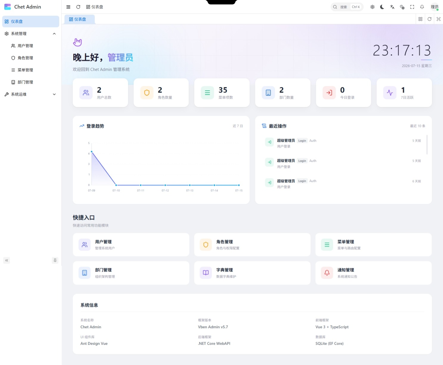
五、最近操作列表与趋势图对齐
仪表盘是两列布局:
.trend-logs-row {
  display: grid;
  grid-template-columns: 1fr 1fr;
  gap: 20px;
}问题:左侧趋势图(含 SVG)高度固定 220px,右侧操作列表条目数不定。
如果右侧条目多 → 撑高整行 → 趋势图被拉伸 如果右侧条目少 → 比趋势图矮 → 不对齐
Chet.Admin 的解法:
.logs-card {
  display: flex;
  flex-direction: column;
  max-height: 320px;       /* ⭐ 限制最大高度 */
  overflow: hidden;
}

.logs-list {
  flex: 1;
  display: flex;
  flex-direction: column;
  gap: 12px;
  overflow-y: auto;       /* ⭐ 超出滚动 */
  min-height: 0;           /* ⭐ flex 子项关键 */
  margin-right: -8px;
  padding-right: 8px;
}关键点:
max-height: 320px:logs-card 高度上限 = 趋势图卡片高度(含 padding)overflow: hidden在外层,overflow-y: auto在内层 listflex: 1+min-height: 0:list 占满剩余空间,且允许收缩(flex 默认 min-height: auto 会撑大)- 自定义滚动条:
.logs-list::-webkit-scrollbar {
  width: 4px;
}
.logs-list::-webkit-scrollbar-thumb {
  background: var(--border-card-hover);
  border-radius: 2px;
}
4px 细滚动条,和卡片设计语言一致。默认浏览器滚动条会破坏美感。
六、英雄区:动效营造氛围
仪表盘顶部有个英雄区,三球漂浮动画:
<div class="hero-section">
  <div class="hero-bg">
    <div class="hero-orb hero-orb-1"></div>
    <div class="hero-orb hero-orb-2"></div>
    <div class="hero-orb hero-orb-3"></div>
  </div>
  <div class="hero-content">
    <!-- 问候语 + 时间 -->
  </div>
</div>.hero-orb-1 {
width: 400px;
height: 400px;
background: #818cf8;
top: -150px;
right: -50px;
animation: orbF1 8s ease-in-out infinite;
filter: blur(80px); /* 关键:高斯模糊 */
opacity: 0.3;
}
@keyframes orbF1 {
0%, 100% { transform: translate(0, 0) scale(1); }
50% { transform: translate(-40px, 30px) scale(1.1); }
}视觉技巧:
filter: blur(80px)把实心球模糊成光晕opacity: 0.3半透明,不抢眼- 三个球不同尺寸、不同动画时长(8s/10s/12s),制造非同步的"呼吸感"
- 问候语 + 实时时钟:
const greeting = computed(() => {
  const h = new Date().getHours();
  if (h < 6) return '夜深了';
  if (h < 9) return '早上好';
  if (h < 12) return '上午好';
  if (h < 14) return '中午好';
  if (h < 18) return '下午好';
  return '晚上好';
});

function updateTime() {
  const now = new Date();
  currentTime.value = now.toLocaleTimeString('zh-CN', { hour: '2-digit', minute: '2-digit', second: '2-digit' });
  const weekDays = ['星期日', '星期一', '星期二', '星期三', '星期四', '星期五', '星期六'];
  currentDate.value = now.toLocaleDateString('zh-CN', { year: 'numeric', month: 'long', day: 'numeric' }) + ' ' + weekDays[now.getDay()];
}每秒更新一次时间,显示用户当前时刻:
timer = setInterval(updateTime, 1000);

onUnmounted(() => {
  clearInterval(timer);  // ⭐ 组件卸载时清理
});
记得 clearInterval!否则切换页面后定时器还在跑,造成内存泄漏。
七、最近操作:图标和颜色映射
每条日志根据 Action 显示不同图标和颜色:
const actionIconMap: Record<string, string> = {
  Login: 'lucide:log-in',
  Logout: 'lucide:log-out',
  Create: 'lucide:plus-circle',
  Update: 'lucide:edit',
  Delete: 'lucide:trash-2',
};

const actionColorMap: Record<string, string> = {
  Login: '#10b981',     // 绿色:登录正常
  Logout: '#6b7280',    // 灰色:退出中性
  Create: '#3b82f6',    // 蓝色:创建中性
  Update: '#f59e0b',    // 黄色:修改注意
  Delete: '#ef4444',    // 红色:删除警告
};

function getActionIcon(action: string) {
  return actionIconMap[action] || 'lucide:activity';
}

function getActionColor(action: string) {
  return actionColorMap[action] || '#6366f1';
}设计思路:
- 颜色按"严重程度"递增:灰 → 绿 → 蓝 → 黄 → 红
- 删除是最危险的操作,红色提醒
- 登录是正常的运维事件,绿色让人放心
时间格式化为"相对时间":
function formatTime(dateStr: string) {
  const d = new Date(dateStr);
  const now = new Date();
  const diff = now.getTime() - d.getTime();
  if (diff < 60000) return '刚刚';
  if (diff < 3600000) return `${Math.floor(diff / 60000)} 分钟前`;
  if (diff < 86400000) return `${Math.floor(diff / 3600000)} 小时前`;
  return `${Math.floor(diff / 86400000)} 天前`;
}
"3 分钟前"比"2026-07-10 14:23:05"更人性化。审计场景的相对时间 = 用户一眼能看出"这件事刚发生"。
八、快捷入口 + 系统信息
8.1 快捷入口
const shortcuts = [
  { icon: 'lucide:users', title: '用户管理', desc: '管理系统用户', path: '/system/user', color: '#6366f1' },
  { icon: 'lucide:shield', title: '角色管理', desc: '角色与权限配置', path: '/system/role', color: '#f59e0b' },
  { icon: 'lucide:menu', title: '菜单管理', desc: '菜单与路由配置', path: '/system/menu', color: '#10b981' },
  { icon: 'lucide:building', title: '部门管理', desc: '组织架构管理', path: '/system/department', color: '#3b82f6' },
  { icon: 'lucide:book-open', title: '字典管理', desc: '数据字典维护', path: '/system/dictionary', color: '#8b5cf6' },
  { icon: 'lucide:bell', title: '通知管理', desc: '系统通知公告', path: '/system/notification', color: '#ef4444' },
];

function goPage(path: string) {
  router.push(path);
}
6 个常用模块快捷入口,每张卡片配色和图标都和统计卡片呼应。
hover 效果:
.shortcut-card:hover {
  border-color: color-mix(in srgb, var(--shortcut-color) 30%, transparent);
  transform: translateY(-2px);
  box-shadow: 0 4px 16px color-mix(in srgb, var(--shortcut-color) 12%, transparent);
}
color-mix 再次立功:每张卡片的边框、阴影都用自己的主题色,不需要为每个卡片写一套样式。
8.2 系统信息
<div class="info-grid">
  <div class="info-item"><span class="info-label">系统名称</span><span class="info-value">Chet Admin</span></div>
  <div class="info-item"><span class="info-label">框架版本</span><span class="info-value">Vben Admin v5.7</span></div>
  <div class="info-item"><span class="info-label">前端框架</span><span class="info-value">Vue 3 + TypeScript</span></div>
  <div class="info-item"><span class="info-label">UI 组件库</span><span class="info-value">Ant Design Vue</span></div>
  <div class="info-item"><span class="info-label">后端框架</span><span class="info-value">.NET Core WebAPI</span></div>
  <div class="info-item"><span class="info-label">数据库</span><span class="info-value">SQLite (EF Core)</span></div>
</div>静态展示,让用户一眼了解系统环境。简单但有用。
九、设计回顾
整套仪表盘的亮点:
- ✅ 零图表库依赖:纯 SVG 实现,包体积零增加
- ✅ 自动刻度:向上取整到 5 的倍数,刻度整齐
- ✅ CSS hover 交互:tooltip、辅助线纯 CSS 实现,零 JS 事件
- ✅ 暗色模式自适应:渐变 ID 切换
- ✅ 并发加载 + 单点降级:局部失败不影响整体
- ✅ 趋势图与列表对齐:max-height + 内部滚动
- ✅ color-mix 配色:CSS 变量驱动,零重复样式
- ✅ 英雄区动效:blur + 非同步动画
- ✅ 相对时间:3 分钟前比绝对时间更人性化
- ✅ setInterval 清理:组件卸载时清理定时器
- ✅ 预留扩展位:TrendItem.RegisterCount 预留注册曲线
十、为什么不用 ECharts
最后说说为什么不用 ECharts。
ECharts 确实强大,但对小型仪表盘来说,代价不划算:
| 维度 | ECharts | 纯 SVG |
|---|---|---|
| 包体积 | +800KB(gzipped ~280KB) | 0 |
| 灵活性 | 配置驱动,难精细控制 | 完全可控 |
| 加载时间 | 首屏多 100ms+ | 即时 |
| 学习成本 | option 配置项 100+ | SVG 标准 |
| 自定义样式 | 受主题约束 | 任意 CSS |
| SSR | 复杂 | 简单 |
什么时候用 ECharts?
- 需要复杂图表(散点图、热力图、桑基图、3D 图)
- 需要大数据量渲染(万级数据点)
- 需要联动多个图表(缩放、刷选)
Chet.Admin 仪表盘只有 1 个折线图,7 个数据点。这种场景用 ECharts 是杀鸡用牛刀。纯 SVG 反而更优雅。
💡 Vben Admin 也集成了 ECharts 插件(
@vben/plugins/echarts),需要时可以引入。
系列预告
到这里,13 个核心模块已经全部讲完:
| 篇 | 模块 |
|---|---|
| 07 | 认证登录 |
| 08 | 用户管理 |
| 09 | 角色管理 |
| 10 | 菜单管理 |
| 11 | 部门管理 |
| 12 | 字典管理 |
| 13 | 仪表盘(本篇) |
下篇预告:第 14 篇开始进入「进阶特性」,包括 审计日志、通知公告、文件上传 等模块。
「Chet.Admin 模块详解⑧:操作审计日志 + 在线用户追踪 🔍」 敬请期待 👀
🔗 GitHub:https://github.com/qiect/Chet.Admin 🔗 Gitee:https://gitee.com/qiect/Chet.Admin ⭐ 觉得不错的话,点个 Star 支持一下吧!
#ChetAdmin #全栈开发 #.NET10 #Vue3 #SVG #仪表盘